Your Instagram profile brings separate publications into one visual space. A recognisable grid can help visitors understand your identity, but it should not become more important than the posts themselves.
Choose a structure that fits your content, available time and goals. The following approaches offer different levels of flexibility and preparation.
What is the profile grid?
Here, the grid means the arrangement of publications on your profile, not the personalised home feed shown to every user. Neighbouring posts can create repeated colours, shapes or themes.
Check the current profile display and crops before building a precise composition. A design based on an old screenshot may not appear exactly the same in a newer interface.
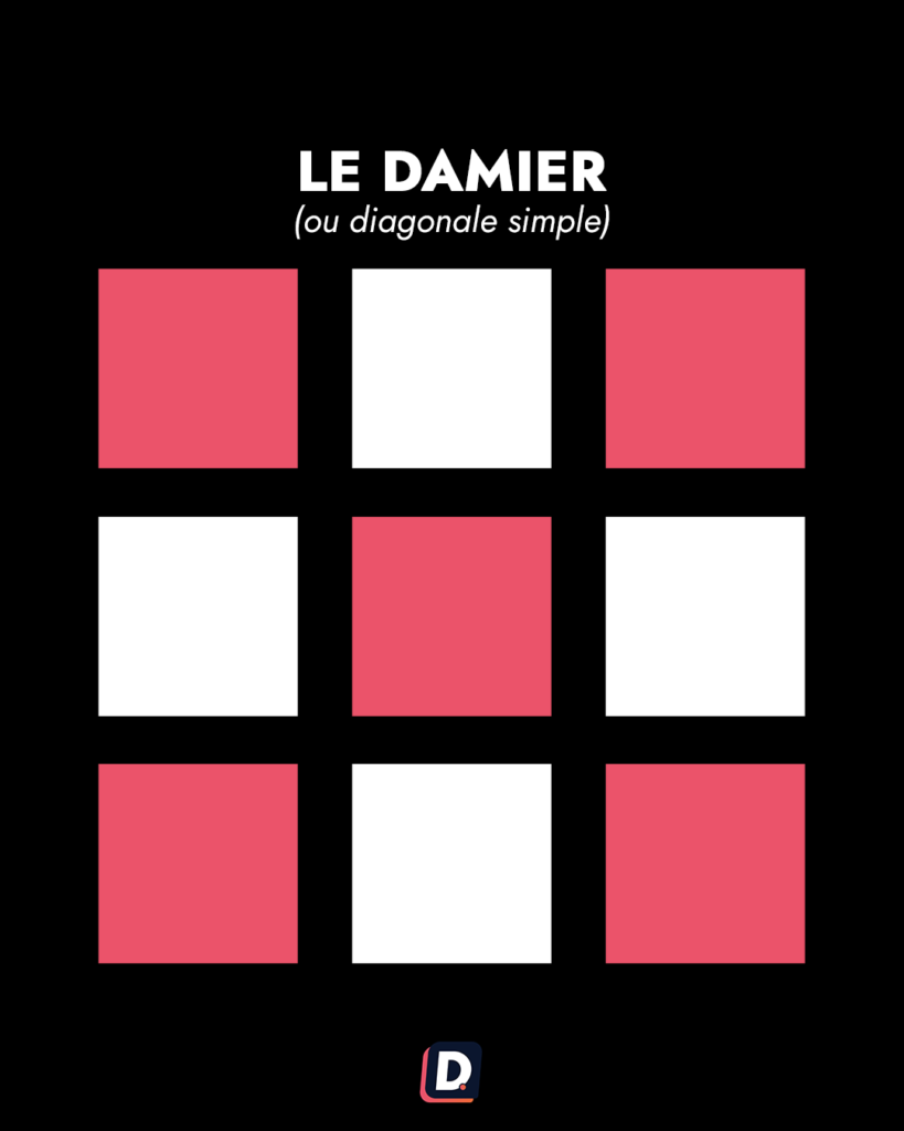
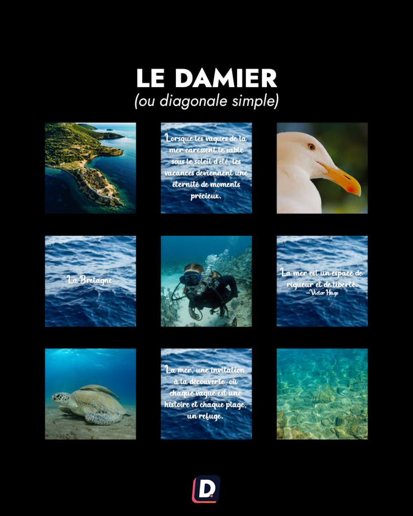
1. The checkerboard
Alternate two clearly different visual treatments. You might combine photography and text-led graphics, or contrast a restrained palette with brighter images.
The contrast makes the pattern visible. It remains relatively simple to plan, but each of the two styles needs enough content to avoid publishing something merely to maintain the alternation.
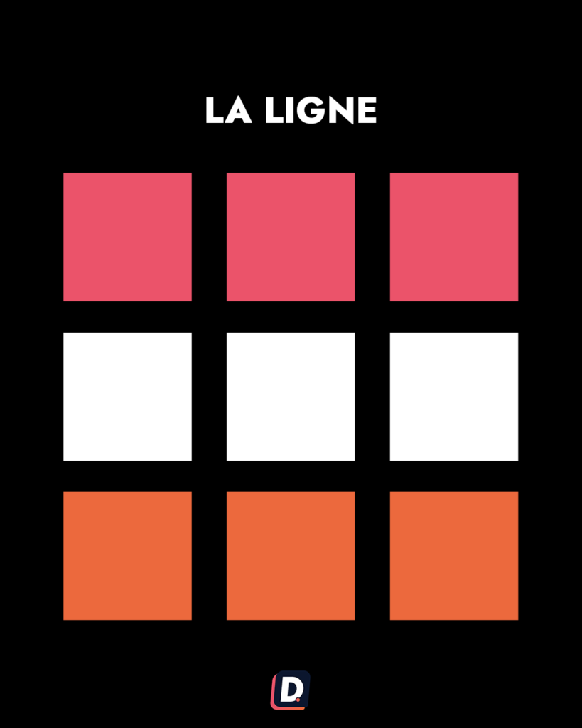
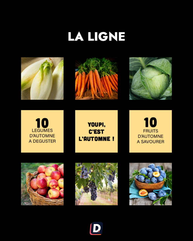
2. Row-by-row storytelling
Prepare a group of complementary images around the same subject, atmosphere or situation. Viewed together, they form a small visual story.
This approach requires coordination of the sequence. Think about the standalone meaning of each image and check how the row appears as new publications are added.
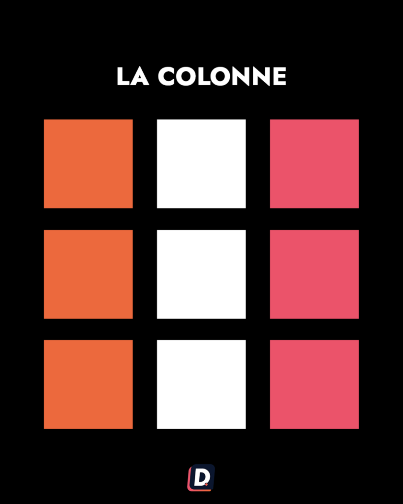
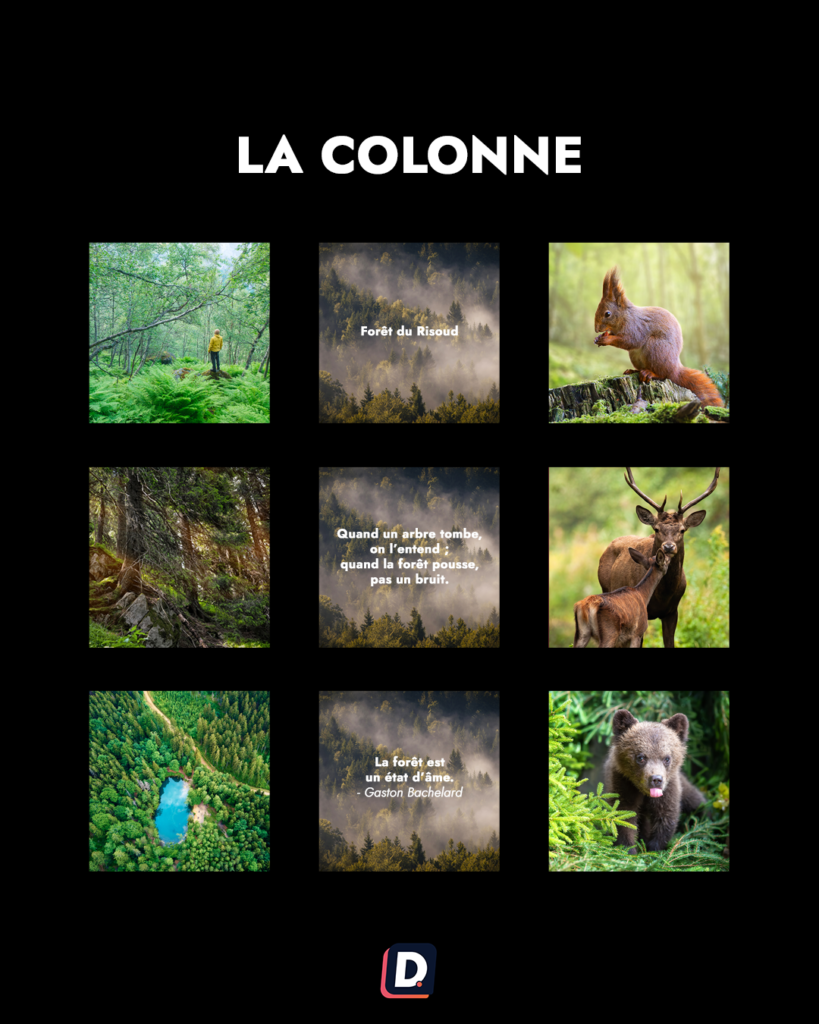
3. Themed columns
Repeat a sequence of visual categories to create a vertical rhythm. One recurring treatment may act as an anchor while the other publications show different subjects.
Plan the order carefully. A column is an overall effect of the sequence, not an excuse to make a useful post wait indefinitely for its decorative slot.
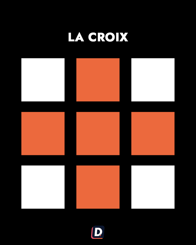
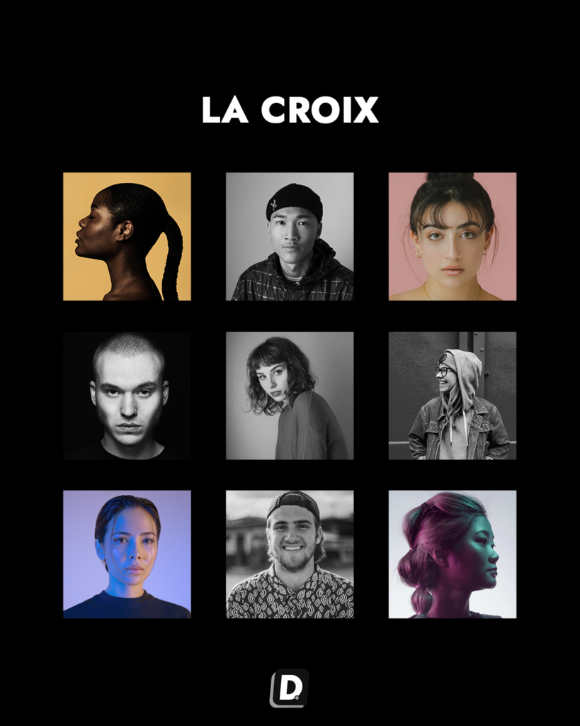
4. Cross-shaped compositions
Use a distinct treatment at selected positions so neighbouring publications suggest a cross. Colour, a quotation or a particular product treatment can provide the contrast.
This requires a broader preview. The pattern needs visual consistency, while the surrounding posts must still have their own purpose.
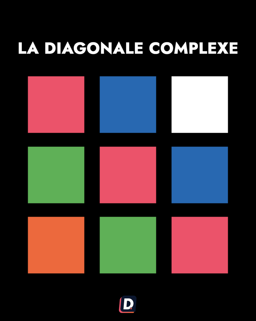
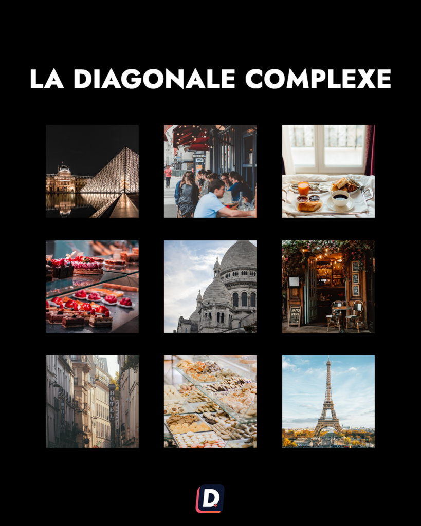
5. Diagonal rhythms
Repeating treatments across several rows can create diagonal movement. A checkerboard can provide a starting point, or additional themes can make the rhythm more complex.
More complex does not necessarily mean more useful. Keep enough flexibility for timely subjects and unexpected publications.
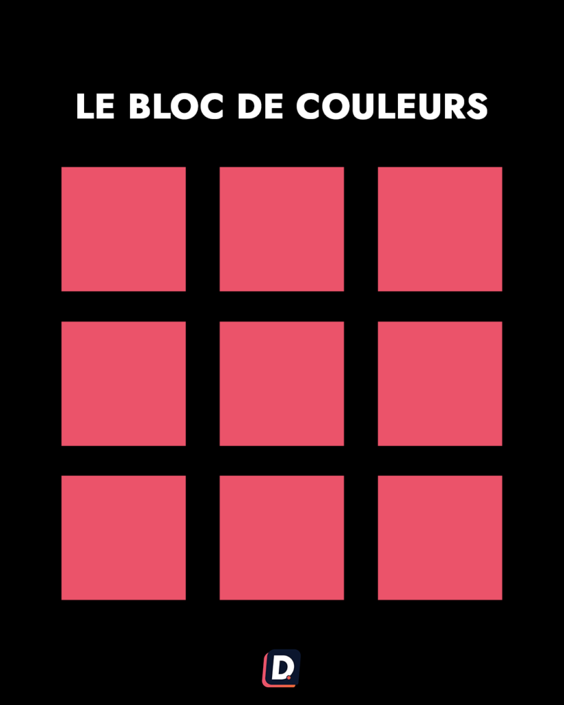
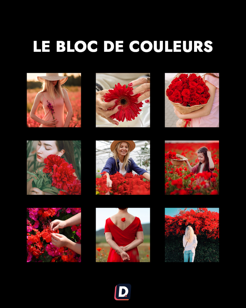
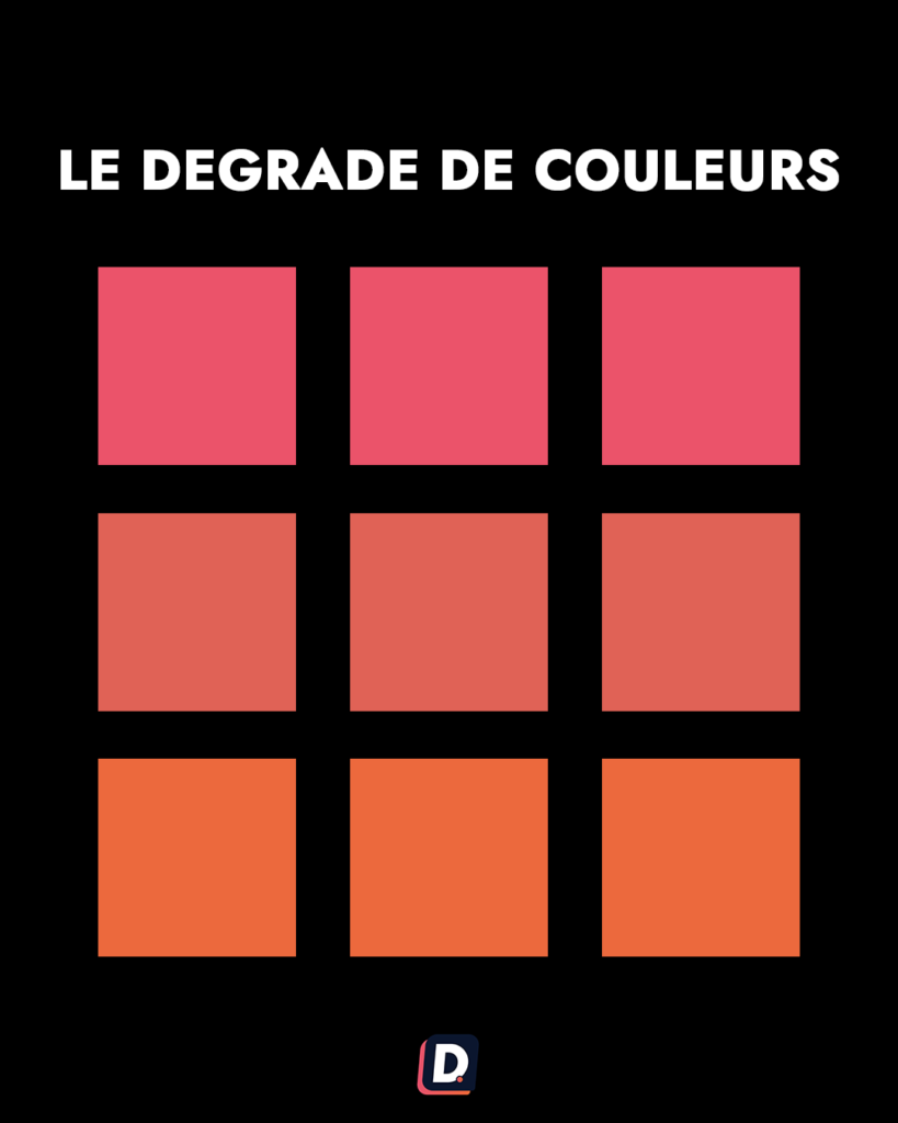
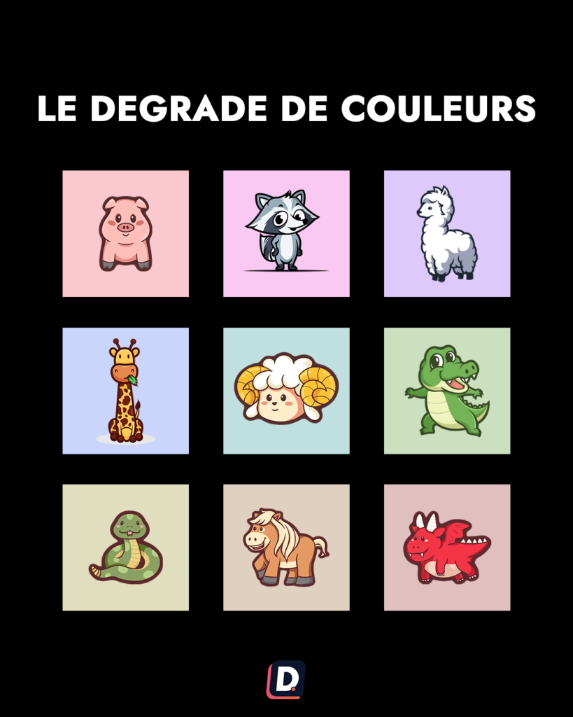
6. A consistent colour palette
A shared palette can create coherence without a strict positional pattern. Select photographs, backgrounds and editing choices that fit the identity you want to communicate.
Options include restrained colours, monochrome imagery, gradual changes or a more vivid progression. Choose the treatment for the brand and subject rather than applying a filter that harms the image.
7. The puzzle grid
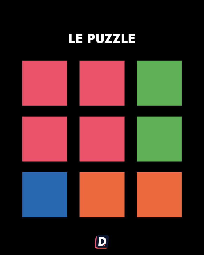
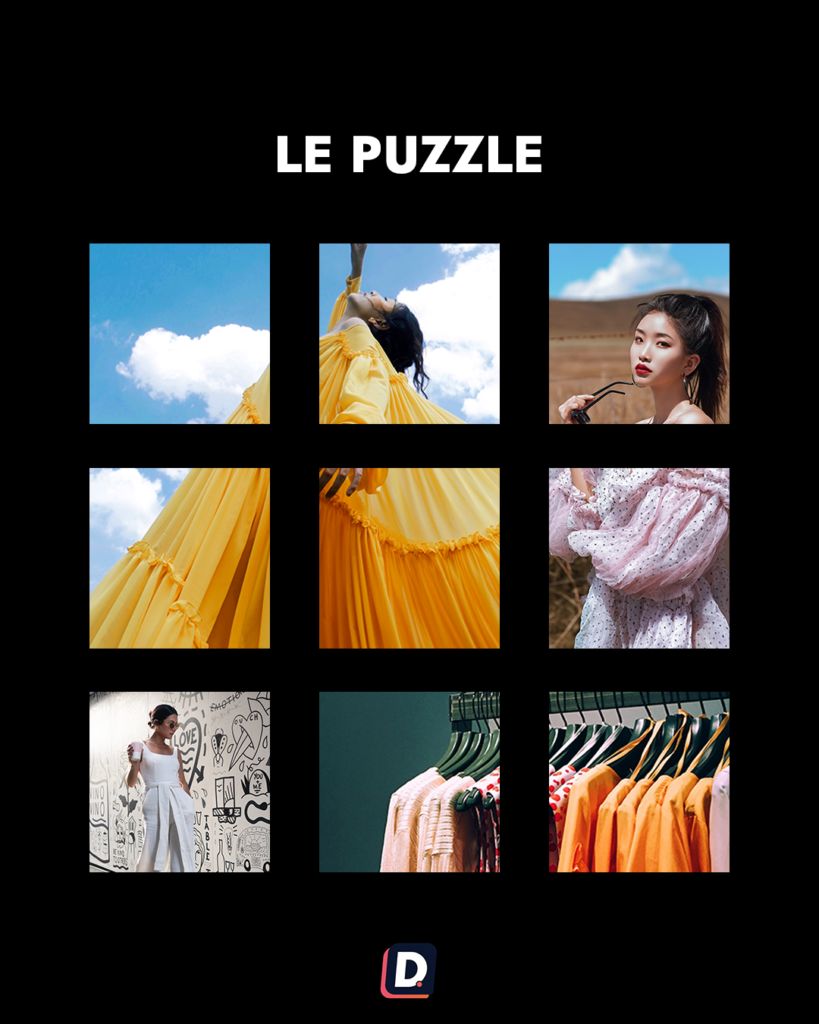
Separate publications form parts of a larger composition. Design tools such as Canva or Adobe software can help prepare the artwork, while a preview helps inspect the arrangement.
This is demanding: fragments should remain understandable when seen individually. Review text, crops and sequence instead of judging only the complete profile screenshot.
8. A collage approach
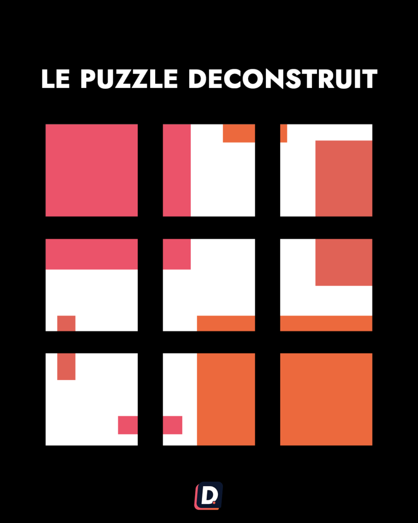
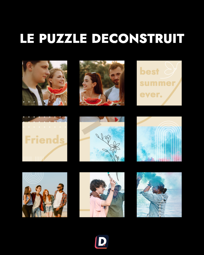
A collage combines visual fragments and different compositions to create an expressive identity. It can suit an artistic direction that deliberately avoids a rigid repeated pattern.
Varying source formats does not guarantee their exact appearance in profile thumbnails. Check the crop and make sure important information remains visible.
9. A mixed grid
Combine elements from several approaches, such as a common palette and occasional rows. The aim is a recognisable identity with room for varied content, not a collection of unrelated experiments.
Plan a style you can maintain
Use an available preview, including Dailyfy's Instagram grid workflow for compatible accounts, to assess upcoming content. Consider the effort required, not only the initial design.
A grid is a brand presentation, while each post also needs to work in its own context. Preserve clarity, relevant subjects and a sustainable rhythm. A simpler style that supports good content is more useful than an elaborate pattern you cannot keep.