

A LinkedIn carousel turns an idea into a sequence readers can explore at their own pace. A document post is particularly useful for explaining a method, presenting research or showing the stages of a project. Its value comes from the information and the reading experience, not simply the sliding format.
Why use a carousel?
Slides divide a complex topic into manageable steps. They can make your expertise easier to understand and give your brand a consistent visual presence. They may also introduce a useful resource or offer, without guaranteeing engagement, enquiries or additional reach.
For a document carousel, prepare pages that work as a coherent publication. Do not treat a PDF as an interactive video player. If a subject needs motion or a live demonstration, a separate video may be a better choice.

1. Define one objective
Decide what readers should understand or do after the last slide. Explain a process, introduce a service, share a lesson or present a product. Trying to deliver every company message at once makes the sequence harder to follow.
2. Build the sequence
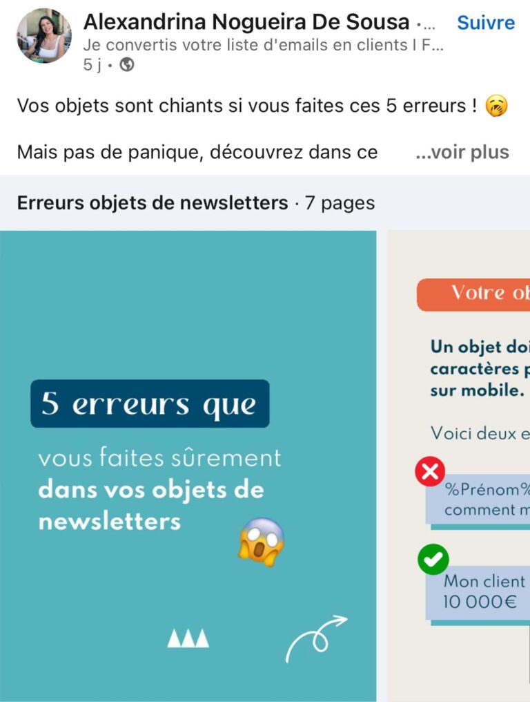
Start with a cover that clearly identifies the subject and its benefit. Follow with a short introduction, a logical progression and a conclusion. Give each page a distinct role, so readers know why they should continue.
Outline the complete argument before designing. Remove repeated points and check that a reader can understand the transition between pages. Keep one main message per slide rather than squeezing an article onto a small screen.
3. Create a consistent design
Canva, Adobe tools or presentation software can help assemble your pages. Choose a small set of colours, readable typography and a repeatable layout. Branding should help recognition without overwhelming the explanation.
Use visuals that support the content. A diagram should clarify a relationship; a photograph should show something relevant. Check permissions for illustrations and identify sources when presenting external information.
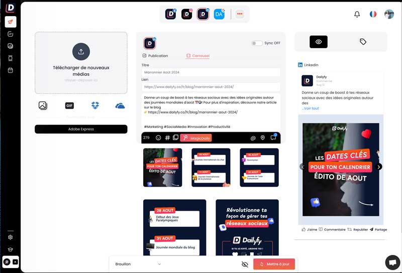
4. Make every page readable
Use concise headings, short passages and purposeful lists. Test text sizes on a phone, not only on a large design monitor. Check contrast, margins and the legibility of charts. A decorative layout is not useful if the information becomes difficult to read.
5. Assemble and review the document
Export a suitable document, such as a PDF, and inspect every page. Check order, spelling and any final call to action. Consult LinkedIn's current supported formats and requirements rather than relying on old size or page limits.
Write a caption that introduces the topic instead of repeating every slide. Invite a relevant response and make any further resource easy to identify.
Give the carousel a useful audience
Share it through appropriate conversations and complementary content. Use relevant hashtags sparingly and work with suitable contributors when that helps the subject. Avoid artificial engagement exchanges and mass requests for immediate reactions.
Choose an appropriate use case
A company history can explain important milestones. A product sequence can demonstrate practical benefits. An industry analysis can make sourced findings understandable. These are possible formats, not proof that a particular organisation achieved results.


Learn from the response
Review the indicators available for your post and the quality of the discussion. Compare similar topics and objectives. Refine the cover, structure or level of detail without assuming that one successful carousel establishes a universal formula.