An Instagram layout is the overall arrangement of photographs, graphics and video covers on a profile. It can make the account's identity easier to recognise. A coherent appearance is useful, but it should support the content rather than turn publishing into a constant struggle to protect a pattern.
Understand the role of the grid
Visitors can see several publications together when they open your profile. That creates an opportunity to communicate tone, subject and visual style. It is not the only way people discover your work: individual posts also appear outside that complete arrangement.
A successful layout therefore needs two levels of clarity. The profile should feel coherent, and each publication should remain meaningful on its own. A visually impressive mosaic does not guarantee followers, enquiries or sales.
1. Define the brand identity
Write down the message, values and atmosphere you want to express. A playful brand and a specialist service may need different visual choices. Select elements that reflect the actual offer rather than imitating an account with a different purpose.
Make the choices understandable to colleagues. A small reference document with examples is more useful than a vague instruction to create something elegant or lively.
2. Create a coherent visual language
Colour
Choose a limited palette that can work across photographs and graphics. Tools such as Adobe Color can help explore combinations. Check contrast and readability instead of selecting colours only because they look attractive together on a large screen.
Typography
Choose a small number of readable fonts and use them consistently. Font libraries and design tools can help compare options. Check the applicable usage permissions, then test titles at the size people will actually see on a phone.
3. Select a maintainable pattern
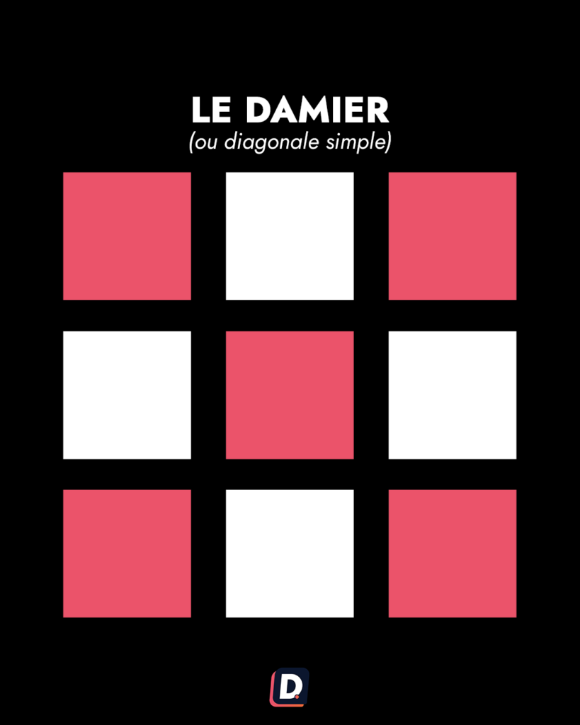
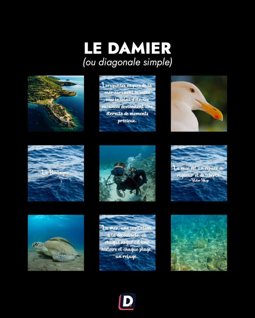
Checkerboard or diagonal
Alternate types of content or recurring visual treatments. A regular theme or colour can create a rhythm without requiring every post to be a piece of one large picture.
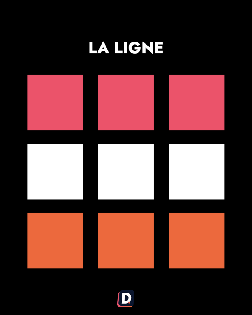
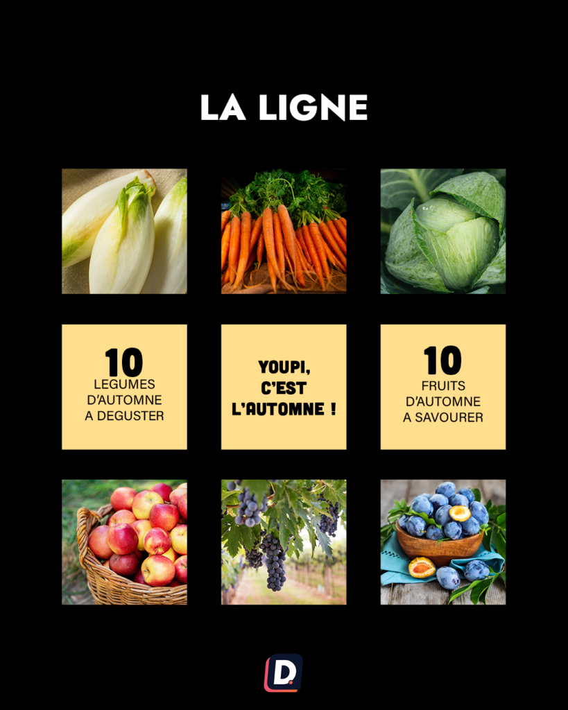
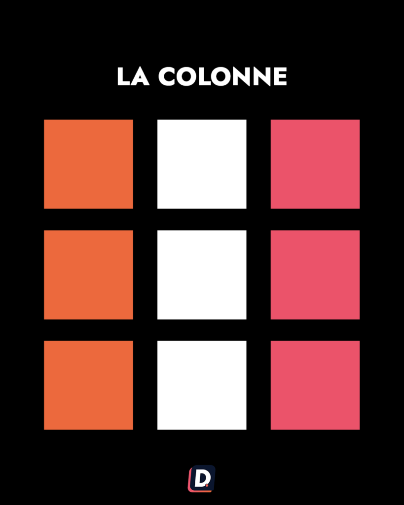
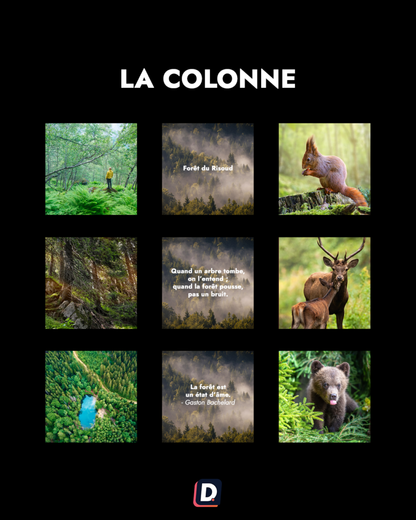
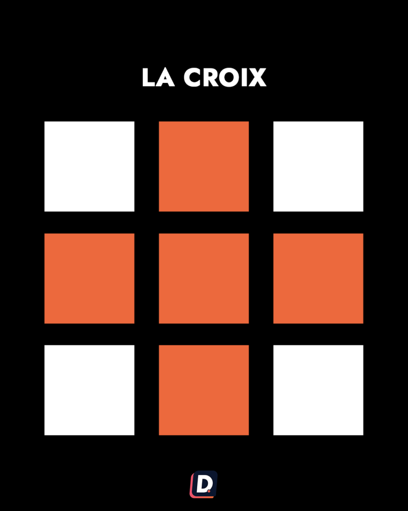
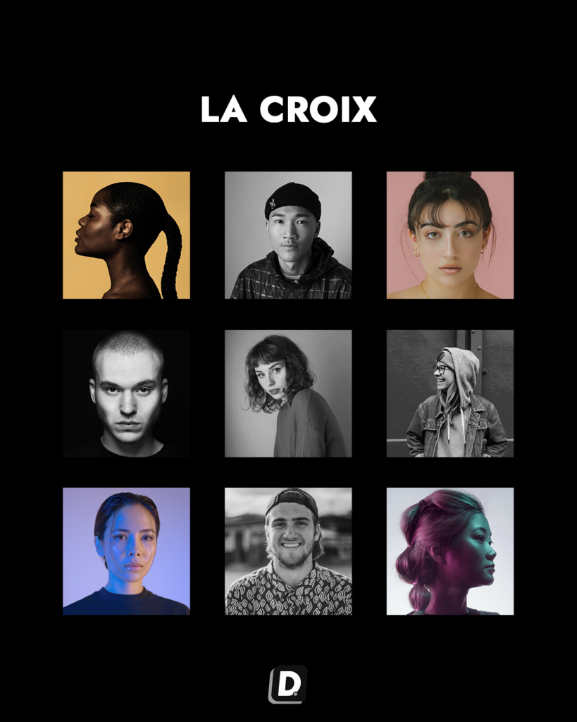
Rows or columns
Group subjects, formats or colours into a repeating arrangement. Consider how future publications and different profile previews affect the pattern. Avoid choosing a structure that makes an urgent useful update impossible to add.
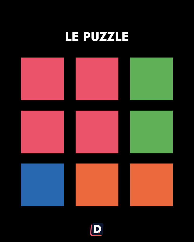
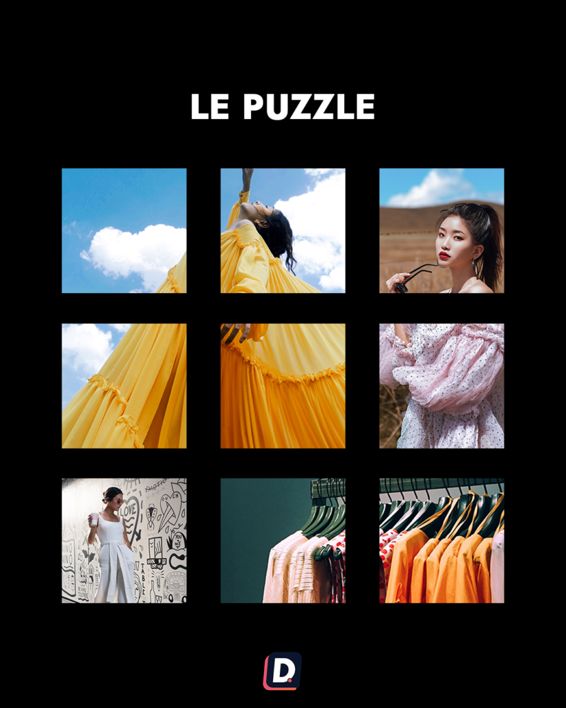
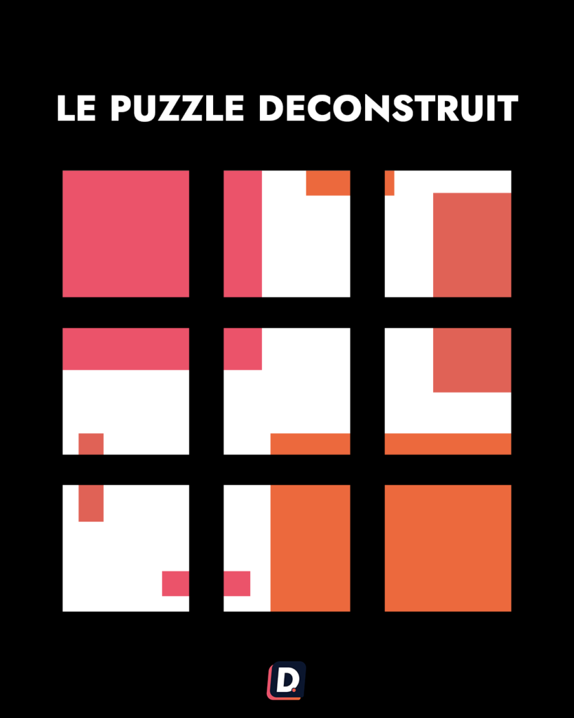
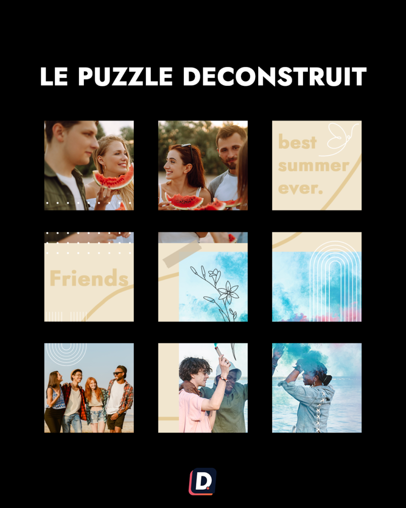
Puzzle
A divided image can create a larger composition across several posts. Inspect each piece individually and check current crop behaviour. Fragments with no independent message can confuse people who never visit the complete grid.
4. Plan the content
Use an editorial calendar to balance topics, production work and publication dates. Choose a realistic frequency and prepare enough material to maintain the approach. Leave space for news and genuine community needs rather than treating aesthetics as the only objective.


5. Preview before publishing
Use a suitable planning preview to inspect the upcoming sequence. Check photographs, text covers and cropping together. Distinguish the simulation of future content from any native option for rearranging already published posts.
Adjust what is unclear and verify the resulting schedule when moving planned items. Continue evaluating whether the layout helps visitors understand your work. The best arrangement is one your team can maintain while consistently publishing useful, recognisable content.